Coffee House Rebrand

Project Overview
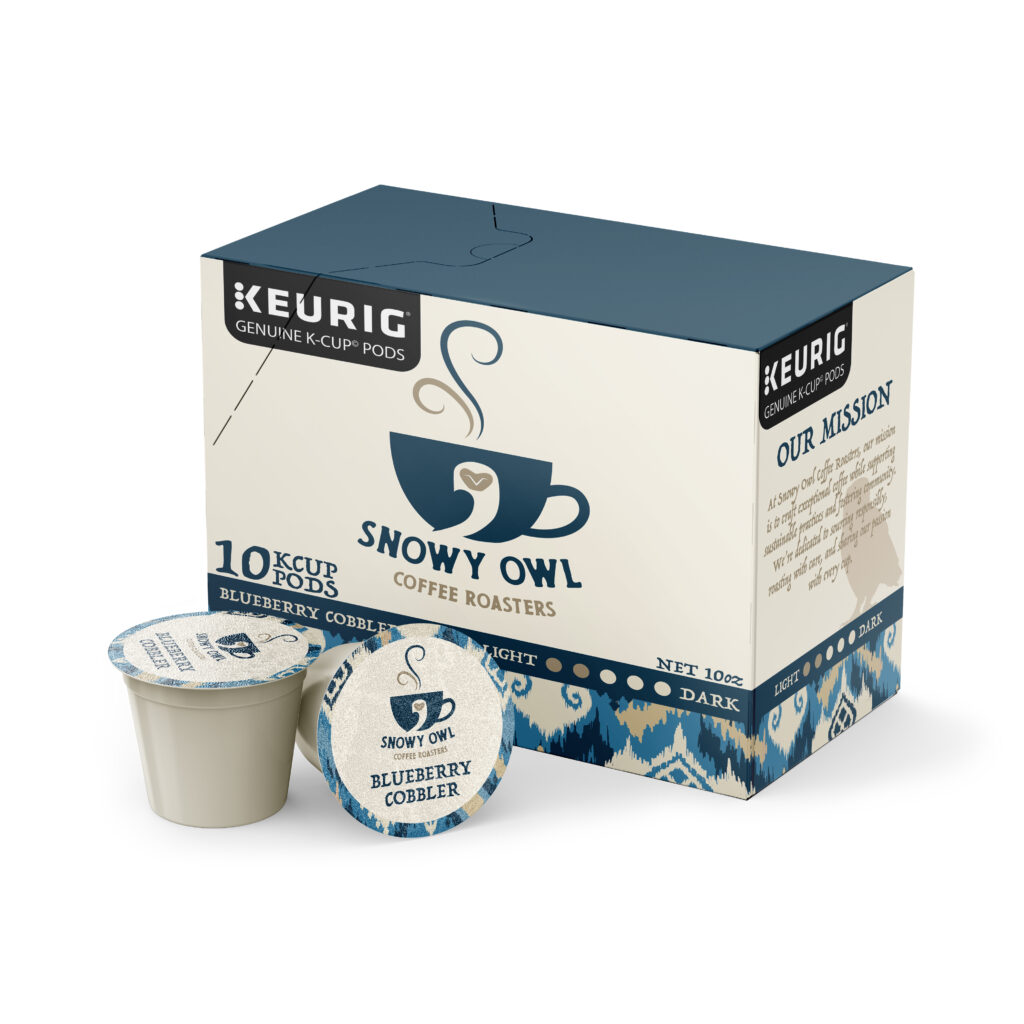
The objective of this assignment was to rebrand a high end coffee house with a new logo design. Each project had to be designed with the brand extension in mind which meant to have a visually cohesive design with some design variety. We needed to make sure the logo would work on a mobile device, outdoor signage, apparel and product.
Key Points
Target Audience: Appeals to professionals and creatives who blend work and leisure in a stylish, comfortable space.
New Logo: Reflects an upscale vibe, easy to recognize across different platforms.
Creative Consistency: Designs should be cohesive but with creative flair on each item.
Additional Suggestions
Some additional suggestions we have is to add discounts, get into more platforms and print out some posters and flyers. With adding discounts it’ll encourage customers to come back and become repeat visitors. Getting into different platforms will ensure more people are seeing your posts. And with posters and flyers people get to know about you just walking around on the street.
Project Name:
Coffee House Rebrand
Rebrand Challenges:
There were a couple challenges while working on this rebrand. The first challenge was matching the vibe of the coffee house. Snowy owl coffee is a very laid back environment, so we had to try our best to rebrand it in the most laid back way possible. The next challenge was the color scheme. We tried keeping the original colors but they didn’t look the best in the new design. We chose to keep the navy blue and add in a tanish beige and a light blue.
Before & After:
In the original logo design you can’t really tell that there is an owl in the logo. You have to look really closely at it to be able to tell. There also isn’t anything showing that it is a coffee house.
In the new design you can clearly see the owl in the logo and can tell it is a coffee house.
Mobile Interface:
To create a better mobile interface for Snowy Owl, they want to make sure their account is set up correctly. They want to make sure they have a clear username (company name) with the logo as the profile picture. Then they want to make sure they have eye-catching images. The better the image the more people are going to look at it. Then they want to have creative captions. They should want them to be creative but still informational.


