-
Reel Case Study
 Read more: Reel Case Study
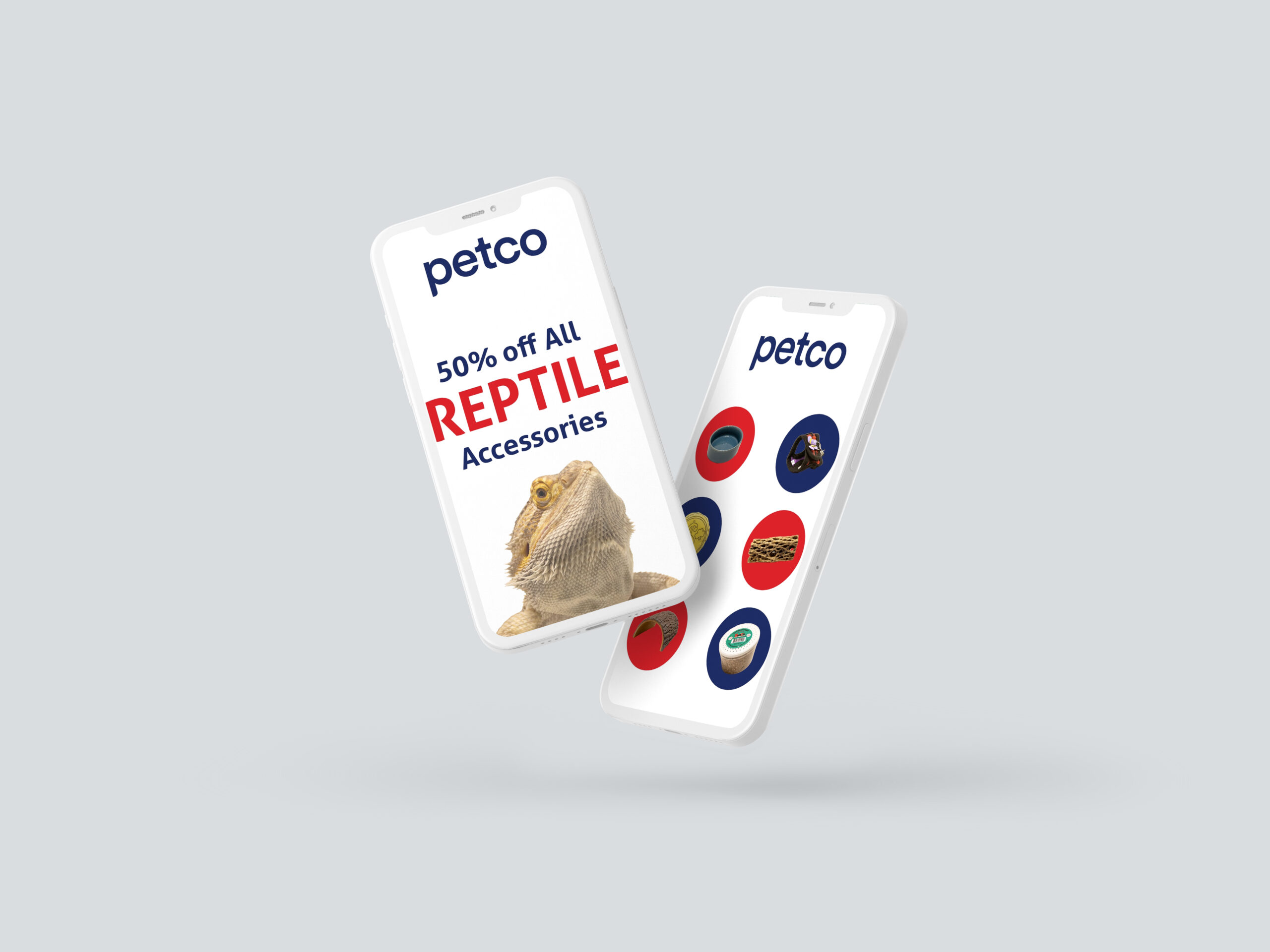
Reel Case Study Disclaimer: The social media ads created by the author for this case study project feature a fictitious representation of a brand-name product. These advertisements are part of an experiential learning exercise and are only imaginative works of fiction. The products are not endorsed by the actual brands mentioned. Objective The objective of…
-
Record Reel
 Read more: Record Reel
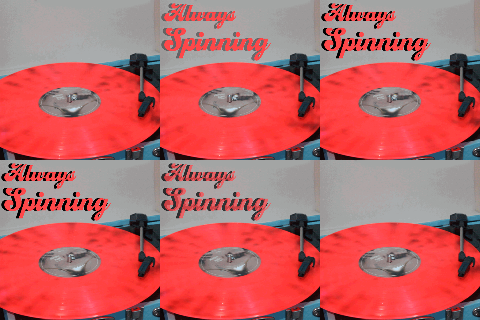
Always Spinning Process Text Enhancement: The caption “always spinning” was given a subtle glow and a slight motion effect to mirror the spinning of the record. Smooth Looping: The spinning motion of the record needed to be perfectly seamless. By carefully selecting and editing the video footage, the loop became fluid, with no noticeable start…
-
B&W Photos
 Read more: B&W Photos
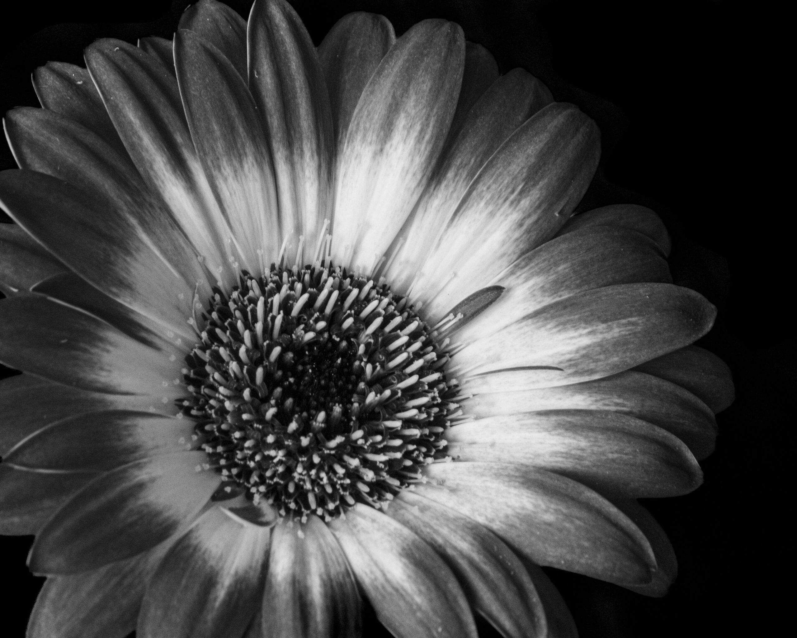
Finding Beauty in Simplicity This black and white photo captures the simplicity and beauty of a single flower. By removing color, the focus shifts to the elegant shape and delicate details of the petals. I was drawn to the flower’s quiet strength and tranquil presence, amidst the chaos of the world. This image serves as…
-
Water Droplet
 Read more: Water Droplet
Transforming Water into Art Process The setup included a DSLR camera with a macro lens for close-up shots, a high-speed flash to freeze the motion, and a pipette to release consistent droplets. Timing was everything—the camera had to be set to a fast shutter speed, and the flash needed to fire at the exact moment…
-
Hometown Rebrand
 Read more: Hometown Rebrand
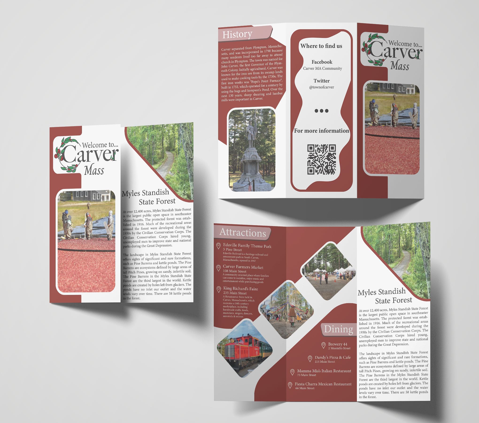
Hometown Rebrand Project Objective Rebranding my hometown of Carver, Massachusetts, was an exciting challenge. Carver has a lot to offer with its history and natural beauty, but it’s most famous for its cranberry bogs and wildlife. My goal was to create a new logo that truly captures the representation of Carver, setting it apart from…
-
Summer Pops
 Read more: Summer Pops
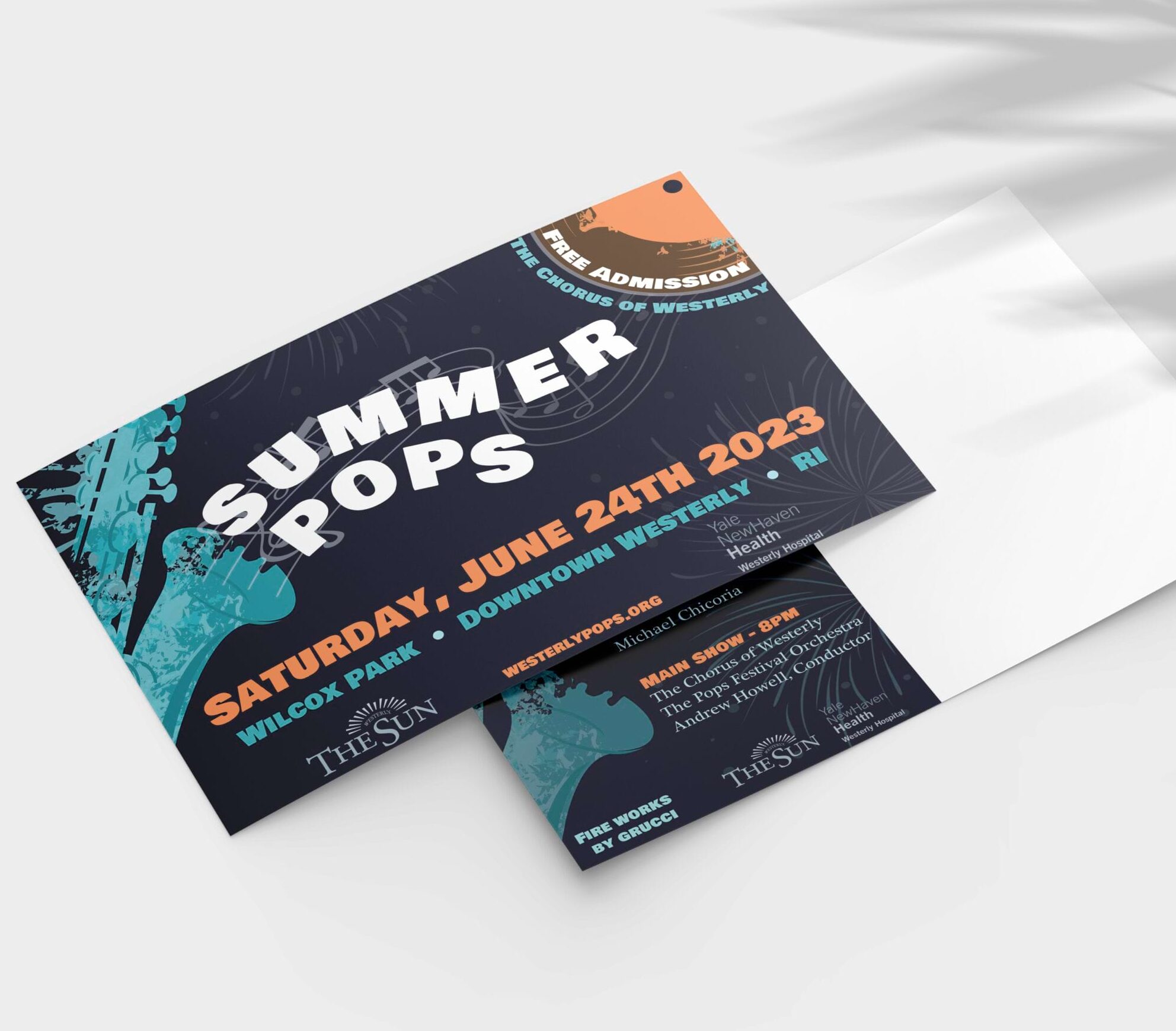
Summer Pops Project Objective This annual concert, held in Wilcox Park, Downtown Westerly, Rhode Island, brings together local talent and professional musicians for a night of music. The poster needed to be vibrant and fun, capturing the event’s spirit and including all essential information, from event details to sponsor logos. To create a poster that truly…
-
Recyclobot
 Read more: Recyclobot
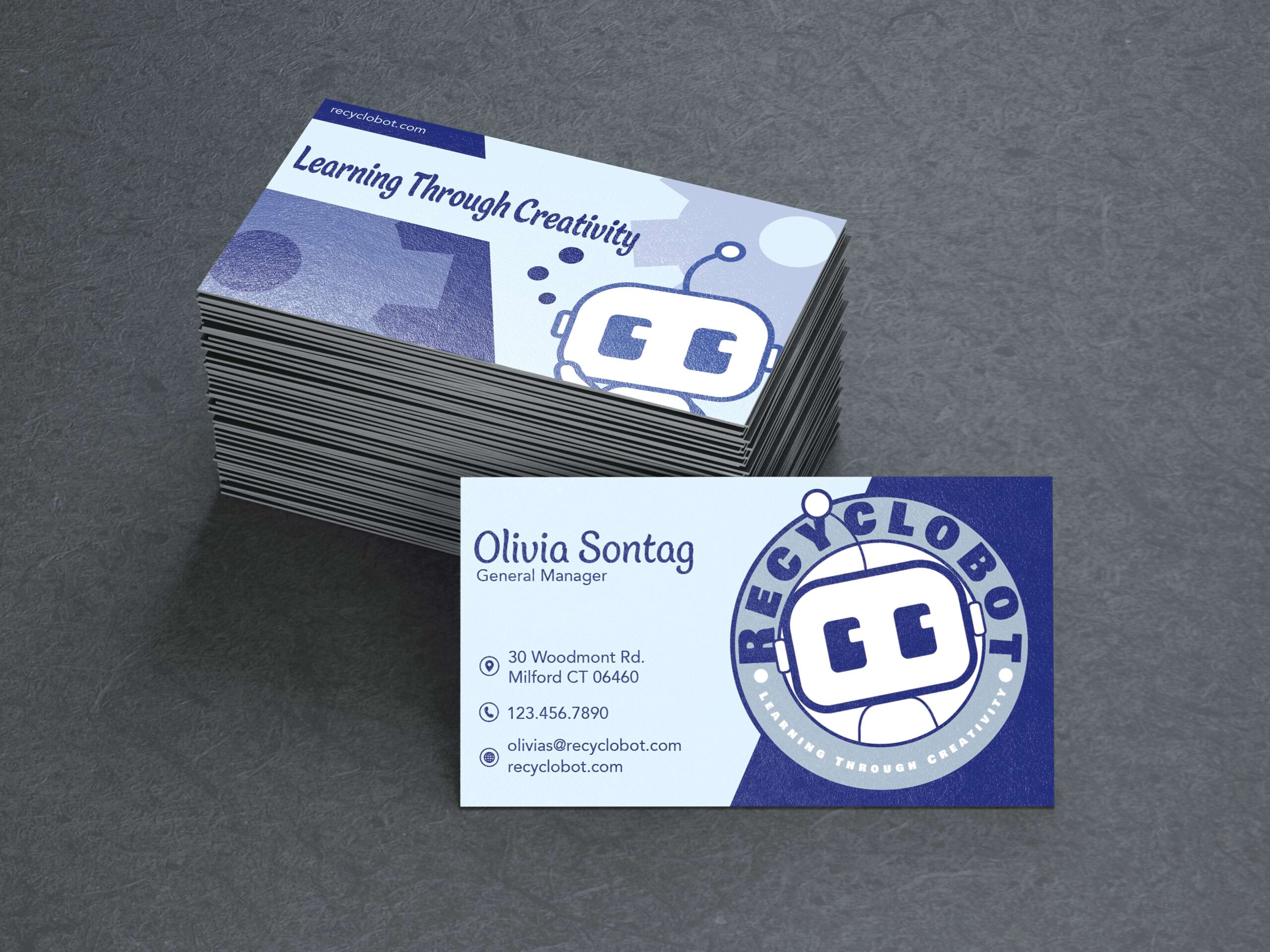
RecycloBot Project Objective The goal was to create a double-sided instruction sheet that’s both informative and visually engaging. One side would feature a poster-style photograph with environmental factoids and the logo we created, and the other would have the step-by-step assembly instructions. The robot is designed for kids aged 6-10 and focuses on teaching them…
-
Magazine Case Study
 Read more: Magazine Case Study
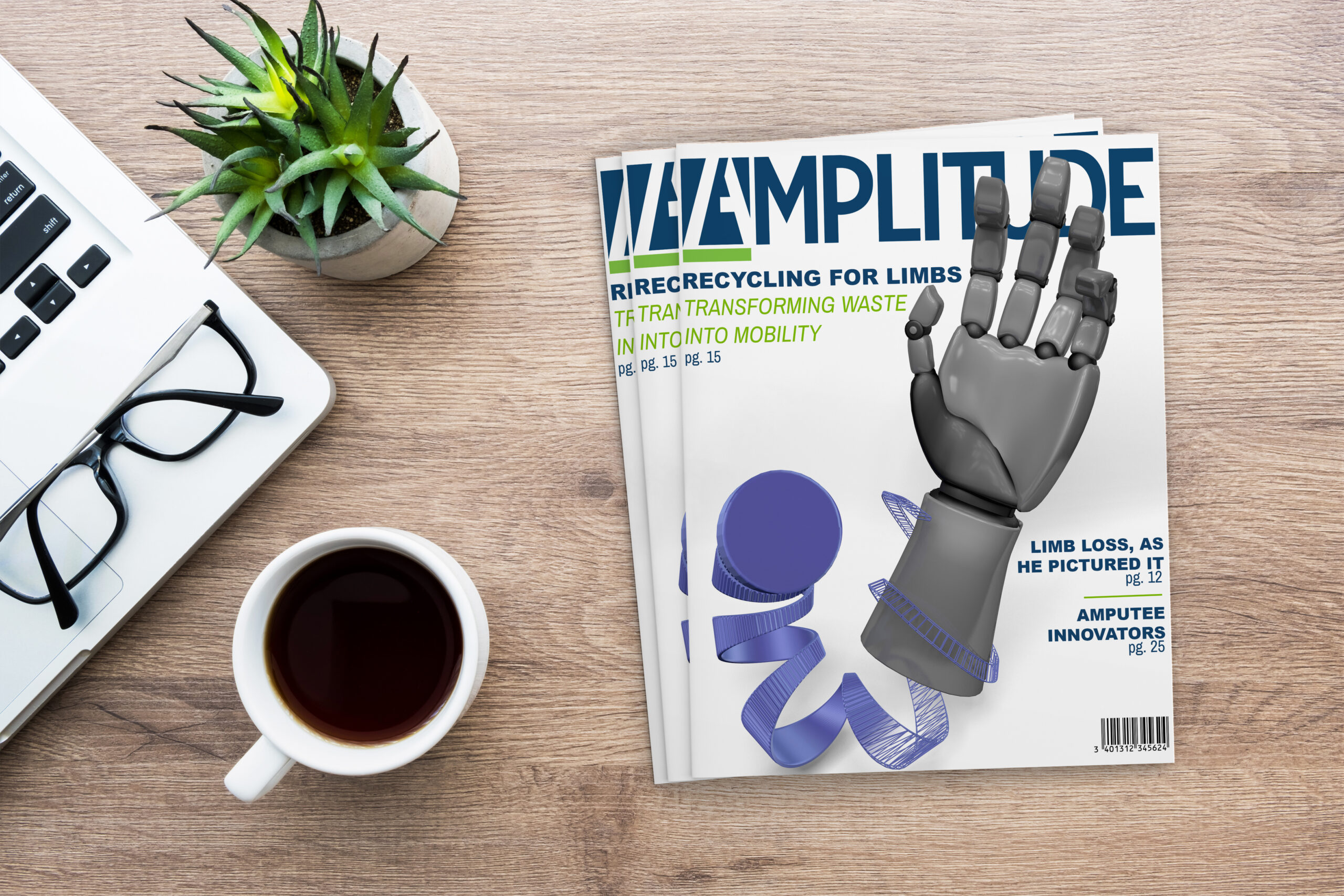
Magazine Case Study Project Objective As a design student I was asked to visualise a magazine cover for engineering prosthetics out of bottle caps. The goal of the cover design was to make a design to visualise that a bottle cap was turned into a prosthetic. I had to choose a topic and a magazine…
-
Personal Brand
 Read more: Personal Brand
Livin Simpl Livin Simpl combines my name and initials, symbolizing my ability to simplify life through design. I chose green as the brand color because it’s my favorite color. Initially, I envisioned a tree as the logo to complement the name “Livin,” but it felt too complex. I then opted for a simpler approach by…